
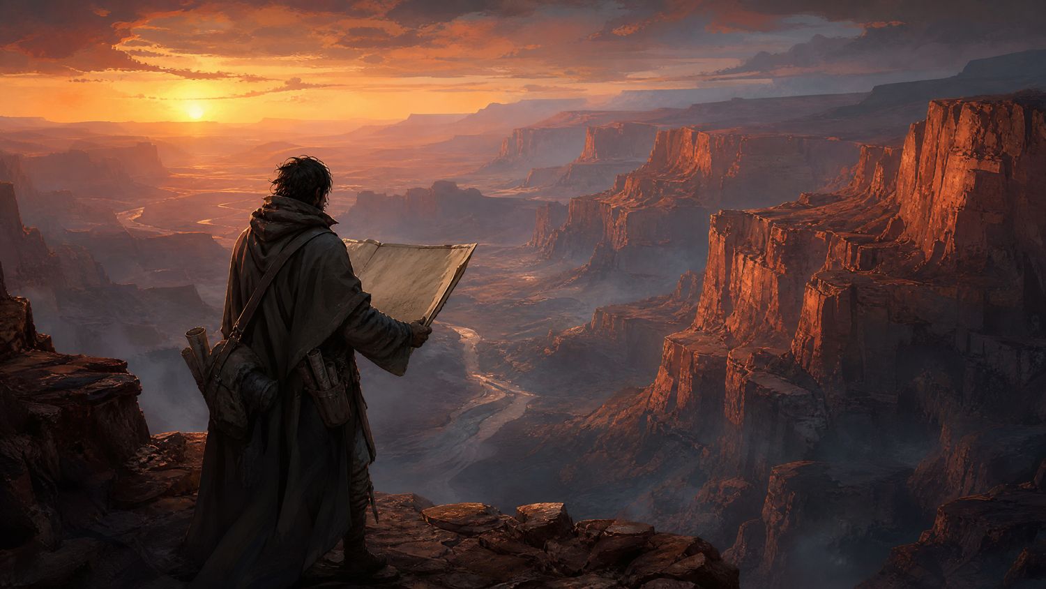
The reason to write about this game is not that its map is attractive. A great many maps are attractive. It is that when we sat down with our standard list of questions — where am I, what is between me and that ridge, how far is it, what have I not looked at — the map answered all four without requiring a second screen, a wiki or a guess.
That sounds like a low bar. It is the highest result in fifty-two games.
What the map actually does
Placing a marker takes two actions: open the map, click where you want it. There is no marker type submenu, no icon palette and no confirmation dialogue. If you want to annotate a marker you can, afterwards, and if you never do the marker still works.
Reading elevation takes one action, because elevation is drawn rather than described. The canyon walls are rendered as shaded strata, and the shading is consistent enough that after about two hours we were estimating drops accurately without checking a number. That is the whole idea of a map, and it is nearly absent from this genre.
| Task | Actions required | File median |
|---|---|---|
| Place a marker | 2 | 5 |
| Read elevation at a point | 1 | 3 |
| Measure distance | 2 | 4 |
| Identify an unexplored area | 1 | Not possible in 44 of 52 |
Fog, inverted
Most exploration games use fog to record where you have been. The map fills in behind you, which produces a pleasant sense of accumulation and answers a question nobody asked, because you already know where you have been. You were there.
Atlas Reach instead marks what it knows you have not looked at. Areas you have crossed without a line of sight onto them are drawn as flat, uninformative shapes; areas you have actually surveyed are drawn in full. The difference is small in description and enormous in use, because it turns the map into a list of things to do rather than a record of things done.
A map that shows where you have been is a certificate. A map that shows what you have not seen is a tool.
The legend
Nineteen symbols, all explained on the map screen itself, in a panel that does not cover the map while it is open. No external reference is required at any point, which we confirmed by playing the entire game without consulting anything.
More unusually, the legend explains the two symbols whose meaning is ambiguous by showing an example rather than describing one. This is a small production expense and it removed the only two questions we had in thirty-four hours.
Where it slips
The options menu is shallow, which is normally praise here, but in this case it is shallow because it is missing things. There is no way to change map symbol size, no colour-blind palette, and text scaling stops at a step below where we would want it for a 1440p display at a normal viewing distance.
The second complaint is that the marker system, elegant as it is, caps at thirty markers with no warning. We hit the cap at hour twenty-two, the game silently refused to add another, and it took several minutes to work out why. A game this careful should not fail silently anywhere.
| Element | Assessment |
|---|---|
| Map screen | Best in the file |
| Fog and survey model | Original and genuinely useful |
| Legend | Complete; self-teaching |
| Options depth | Thin; missing scaling and palette |
| Marker cap | Silent failure at thirty |
Where this leaves it
An interface that was clearly used by people who had questions rather than by people ticking off features. The map is the best we have measured, the fog model deserves to be copied widely, and the missing accessibility options and the silent marker cap are the only two things standing between this and a higher figure.