
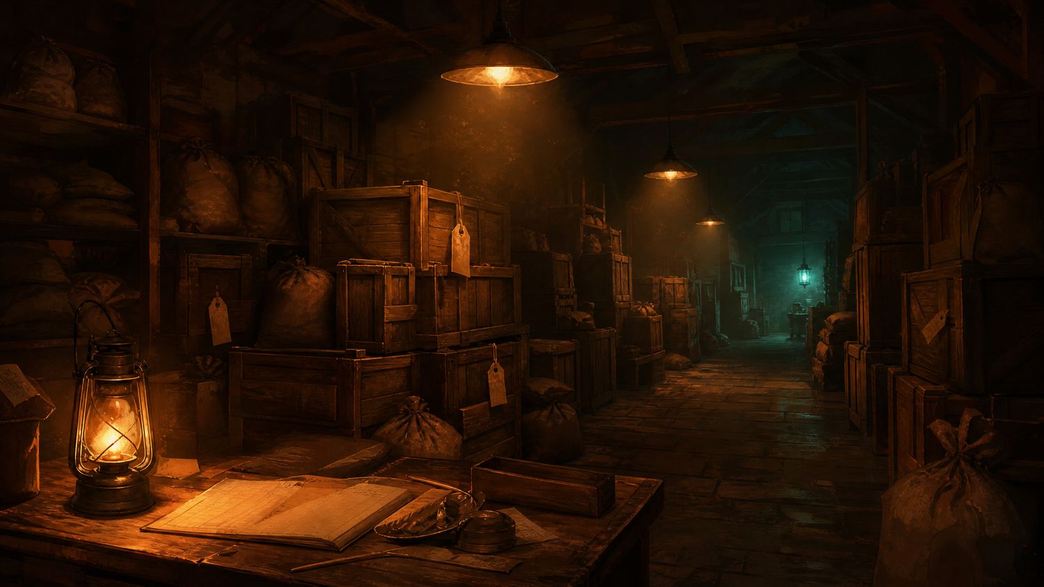
This is a game about carrying capacity. You have a wagon, a route, a set of demands at the far end, and a warehouse of things that weigh different amounts and spoil at different rates. Every turn consists of the same question, asked about different objects: which of these two is the better thing to load?
The interface cannot show you two objects at the same time. Not in a comparison view, not side by side, not in a table. To evaluate a pair you open one, read four values, close it, open the other, read four values, and hold the first set in your head while you do.
The missing screen
Six layers from the main view to an item's full detail: warehouse, category, subcategory, list, item, detail tab. Backing out to look at the second item returns you to the list but not to your scroll position, which adds a further two actions on any list longer than a screen.
We counted seven actions for a single comparison as the median across forty trials, and the figure was stable. It is not a matter of learning the menu; the actions are structural.
| Step | Actions | Notes |
|---|---|---|
| Reach item A detail | 3 | From warehouse view |
| Return to list | 1 | Scroll position lost |
| Recover position | 1 | Longer lists cost more |
| Reach item B detail | 2 | Category already open |
| Total | 7 | File median is 4 |
Counting the workaround
What players actually do, and what we ended up doing, is write it down. We kept a paper note of the four values for each candidate item and compared on paper, which is faster than the menu and is an indictment rather than a solution.
Timed across forty trials, the median comparison took forty-one seconds including the note. A campaign involves several hundred such decisions. The arithmetic is unpleasant: a substantial fraction of the twenty-nine hours we spent with this game was spent transcribing numbers that were already on the screen a moment earlier.
When a player reaches for paper, the interface has already lost. The only remaining question is how much of the playtime it takes with it.
Three hidden values
Three quantities that the simulation uses are not displayed anywhere. Spoilage rate is described in words rather than numbers, road wear is not shown at all, and the demand multiplier at the destination is visible only after arrival, which is precisely too late to be useful.
We established all three by experiment, which took roughly four hours and is not a thing a game should require. Concealing a number that the outcome depends on is different from concealing a plot point, and it is the failure we mark hardest in this file.
What is good here
Considerable amounts. The warehouse view itself is legible and well organised, the typography holds at 1080p, the route screen is clear, and the options menu is unusually complete with full remapping, three text sizes and a colour-blind palette that we tested and found correct.
The underlying game is also good. There is a real logistics problem here with genuine tension in it, and that is exactly why the missing comparison screen is worth this many words: nothing else stands between this design and a much higher score.
| Element | Assessment |
|---|---|
| Comparison view | Absent; the central failure |
| Menu depth | Six layers; scroll position lost |
| Hidden values | Three, all outcome-relevant |
| Legibility | Good at both resolutions |
| Options and remapping | Complete and correct |
Where this leaves it
A good logistics game with an interface that refuses to do the one thing logistics requires. The options menu shows that somebody here cared about the player; the comparison screen shows that nobody watched one play for an hour. Fix one screen and this is an eight.